Design a common, consistent search engine for all OUIGO subsidiaries on a global website. Modernize and standardize a global search engine that works for all countries in which OUIGO operates.
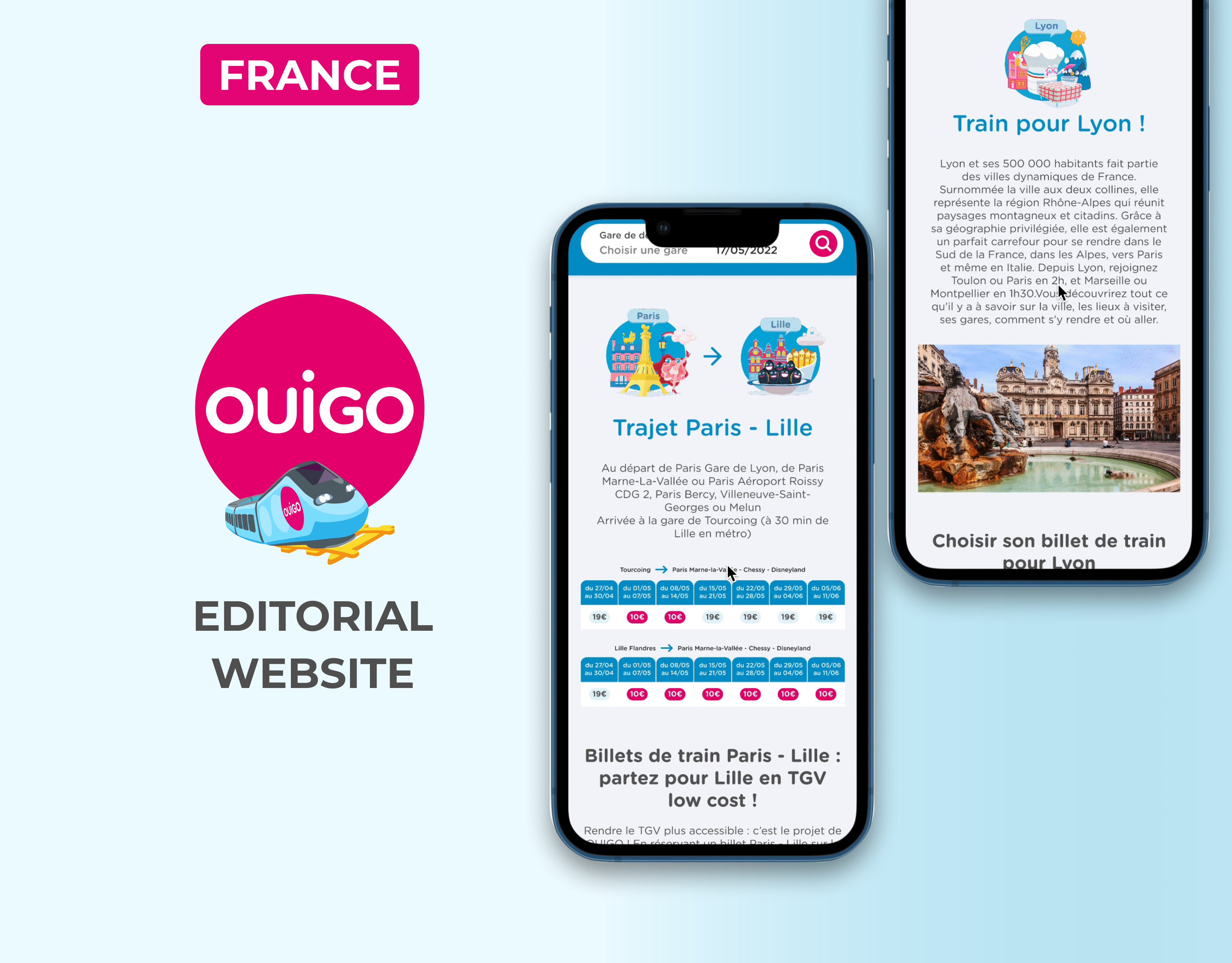
In preparation for the Paris 2024 Olympic Games and to establish a stronger European presence, OUIGO plans to develop a unified global website that integrates ticket searches for both France, Spain and other future destinations. Currently operating separate platforms in each country, OUIGO aims to merge these services into a single site, enabling users to search for tickets across both markets in one place. Depending on the user's search, they will be seamlessly redirected to the appropriate sales site for France or Spain. This initiative not only streamlines the booking process for international travelers during the Olympics but also serves as a strategic step toward expanding OUIGO's footprint across Europe, enhancing its appeal to a broader, pan-European audience.
Challenges
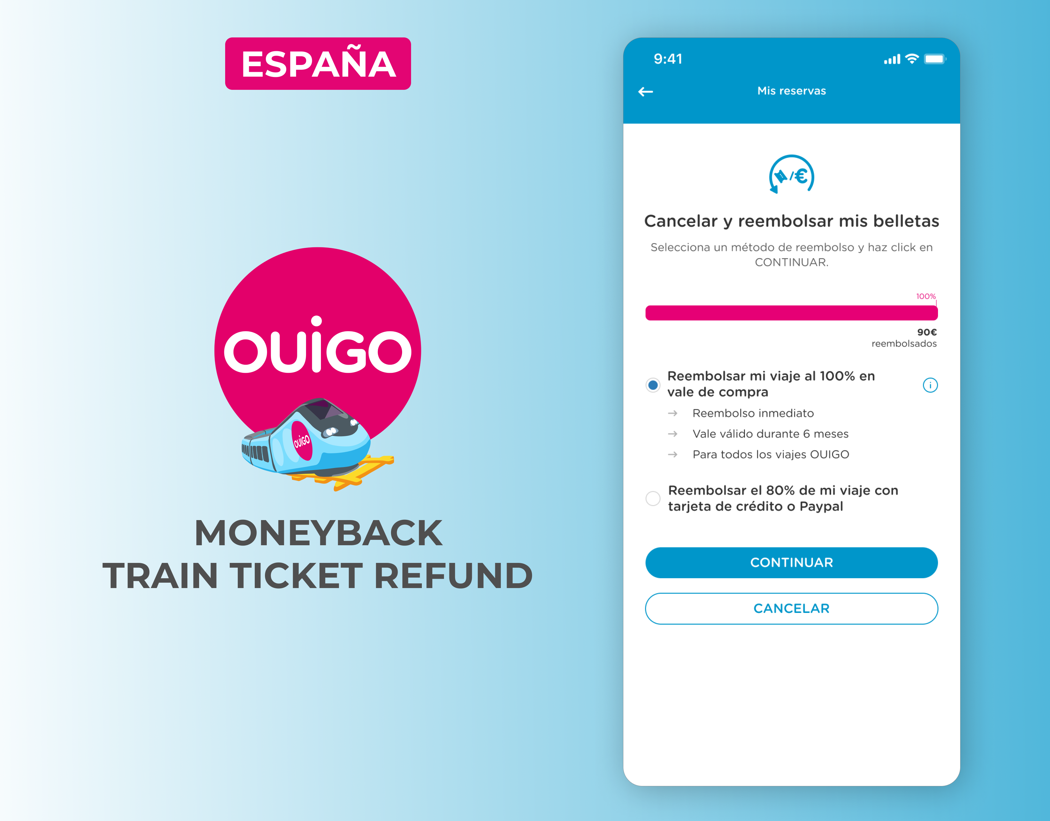
Although there is a desire for homogenization, each country has its own sales habits and conditions. For example, in France, adding a pet is displayed at the same level as adding passengers, whereas Spain prefers to offer it later in the journey as a sales option.
Today, the display of the add-passenger field uses symbolic pictograms. For accessibility and universality, I've suggested using text instead of pictograms.
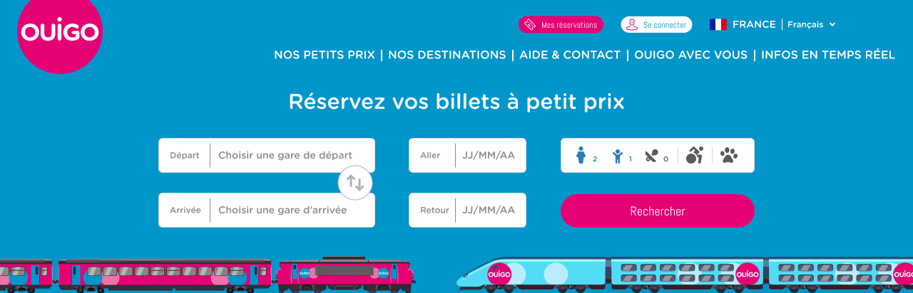
France search engine
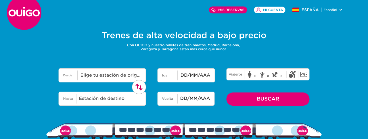
Spain search engine
Analysis
The old version of the OUIGO search engine has a functional but simple and somewhat rigid interface. The design is basic, with little visual distinction between the various elements, which can make navigation less intuitive. The interface lacks dynamism and engagement, with a dense organization of information, which could limit the user experience.

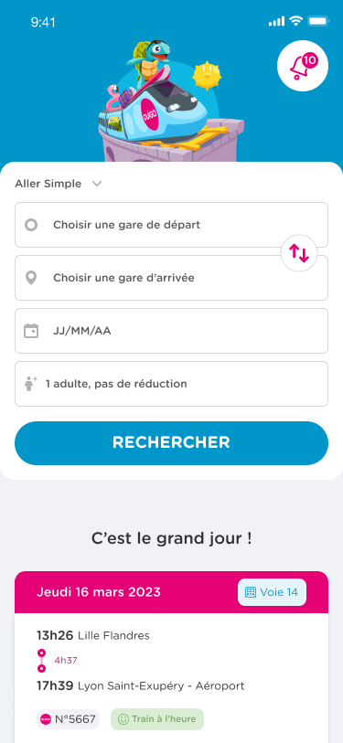
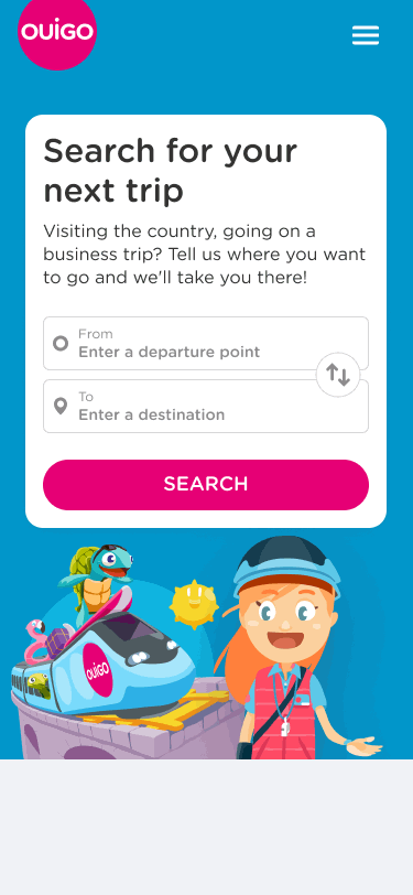
Rework
The new version of the OUIGO search engine features a more modern, colorful and interactive interface.
The search fields are distinct, playful and better organized, making navigation easier. The addition of attractive visuals and characters makes the experience more user-friendly and engaging, while reinforcing the brand image. Functionalities are more intuitive, with a better structured hierarchy of information, offering a more fluid and enjoyable user experience.

Labels and Icons were added inside all input fields
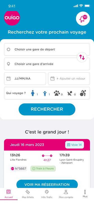
App Homepage and Search Engine
The OUIGO app homepage primarily features a search engine for making reservations. In addition, it offers quick access to other essential sections, such as reservations, user accounts, and settings. The goal of the redesign was to restructure and optimize the homepage, improving its layout and functionality to provide a more streamlined, user-friendly experience. This enhancement aims to simplify navigation, making it easier for users to quickly access key features and complete their tasks efficiently.
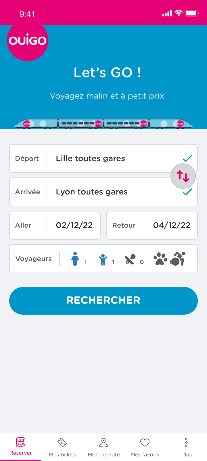
The current interface has several areas for improvement. The OUIGO header and logo take up too much space.
The interface is currently dominated by the search engine, which could overshadow other useful information.
Selection fields could be simplified to make the user experience more fluid. For example, merge round-trip fields to minimize input steps. Labels take up a lot of space in the input field.
There is no quick access tab for notifications.
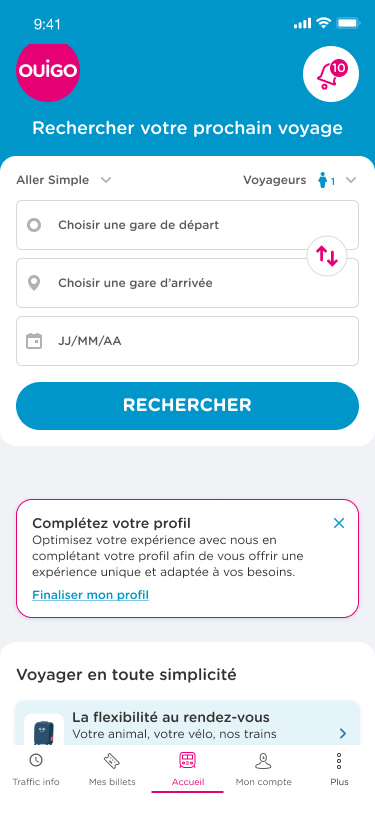
Several iterations have been suggested for the homepage. Among the changes made were :
- Reducing header size to optimize available space.
- Introduction of a floating button to display notifications.
- Revision of input fields for dates and passengers, to make them more intuitive and ergonomic.
- Reducing header size to optimize available space.
- Introduction of a floating button to display notifications.
- Revision of input fields for dates and passengers, to make them more intuitive and ergonomic.