Aéroport de Paris is committed to improving the user experience across all its digital and physical interfaces. This includes an overhaul of its mobile application, optimization of the marketplace to facilitate online purchases, and modernization of the information kiosks present in its airports. The aim is to make all these platforms more intuitive, faster and more accessible, responding to travelers' needs at every stage of their journey, while integrating advanced functionalities for simplified navigation and greater fluidity of use.
Customer Journey


Homepage
The current organization of the home page is not ideal for effectively orienting the user, and accessibility problems related to colors persist.
Our solution: We redesigned the architecture to better meet the user's needs and objectives:
The various entries were reorganized and grouped into sections, with priority given to certain key options.
Titles have been added to each section to clarify the proposed paths (e.g.: consult flights, find your way around, explore...).
A visual hierarchy reinforced by the use of colors now guides the user in a more fluid and accessible way.
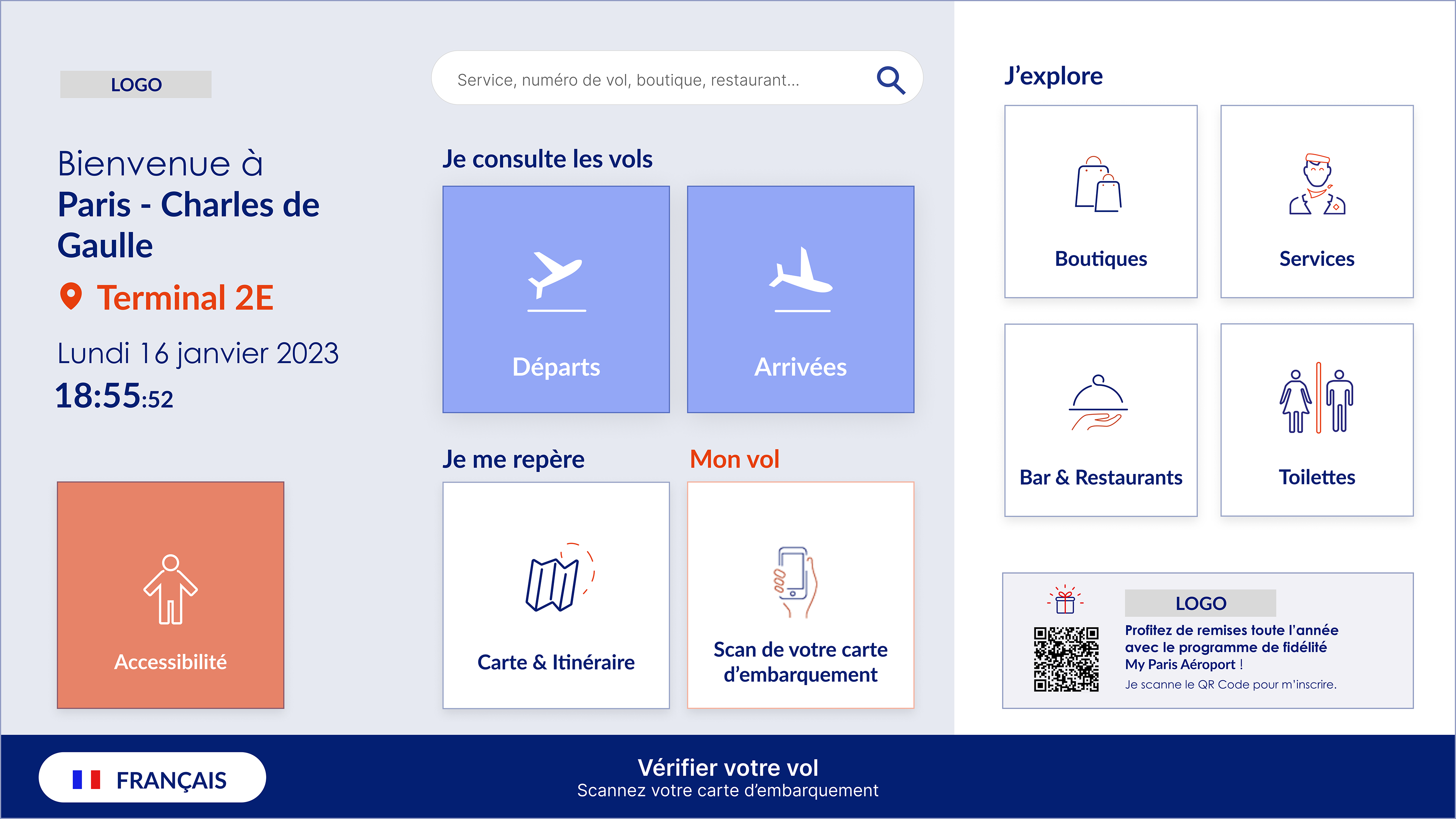
Accessibility button: We've added an “Accessibility” button (in orange, bottom left) to highlight the services available at the airport.
Consulting the departing flights
The current page is functional according to our expertise, but the mechanism for the appearance of the search-related keyboard requires adjustment.
Our solution: We have redesigned the search bar to offer a more fluid experience: the user can first browse the page, then, if the desired information is not found, launch a search at that point. The placeholder is now more explicit, clearly indicating what the user can search for.
Our solution: We have redesigned the search bar to offer a more fluid experience: the user can first browse the page, then, if the desired information is not found, launch a search at that point. The placeholder is now more explicit, clearly indicating what the user can search for.
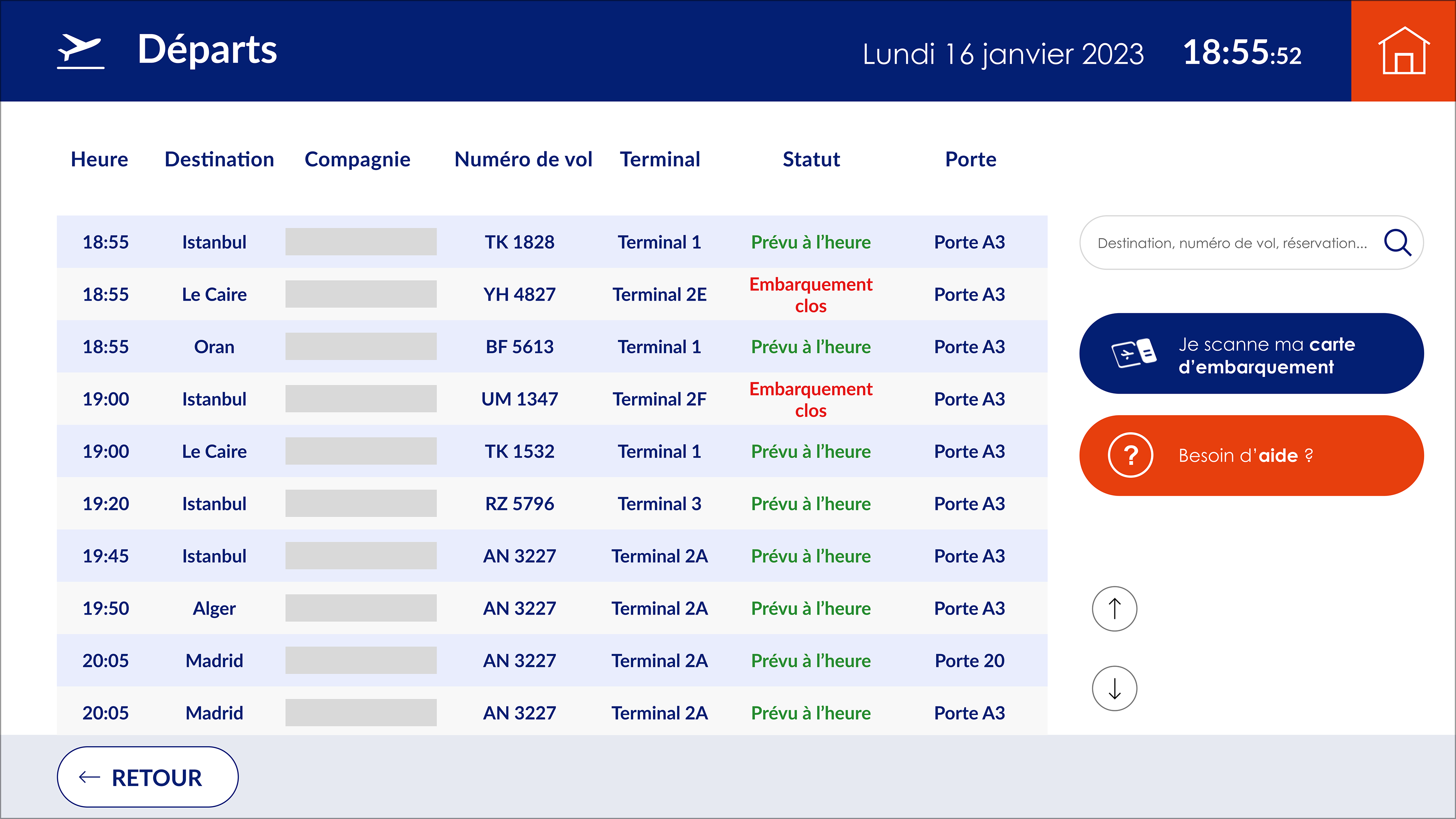
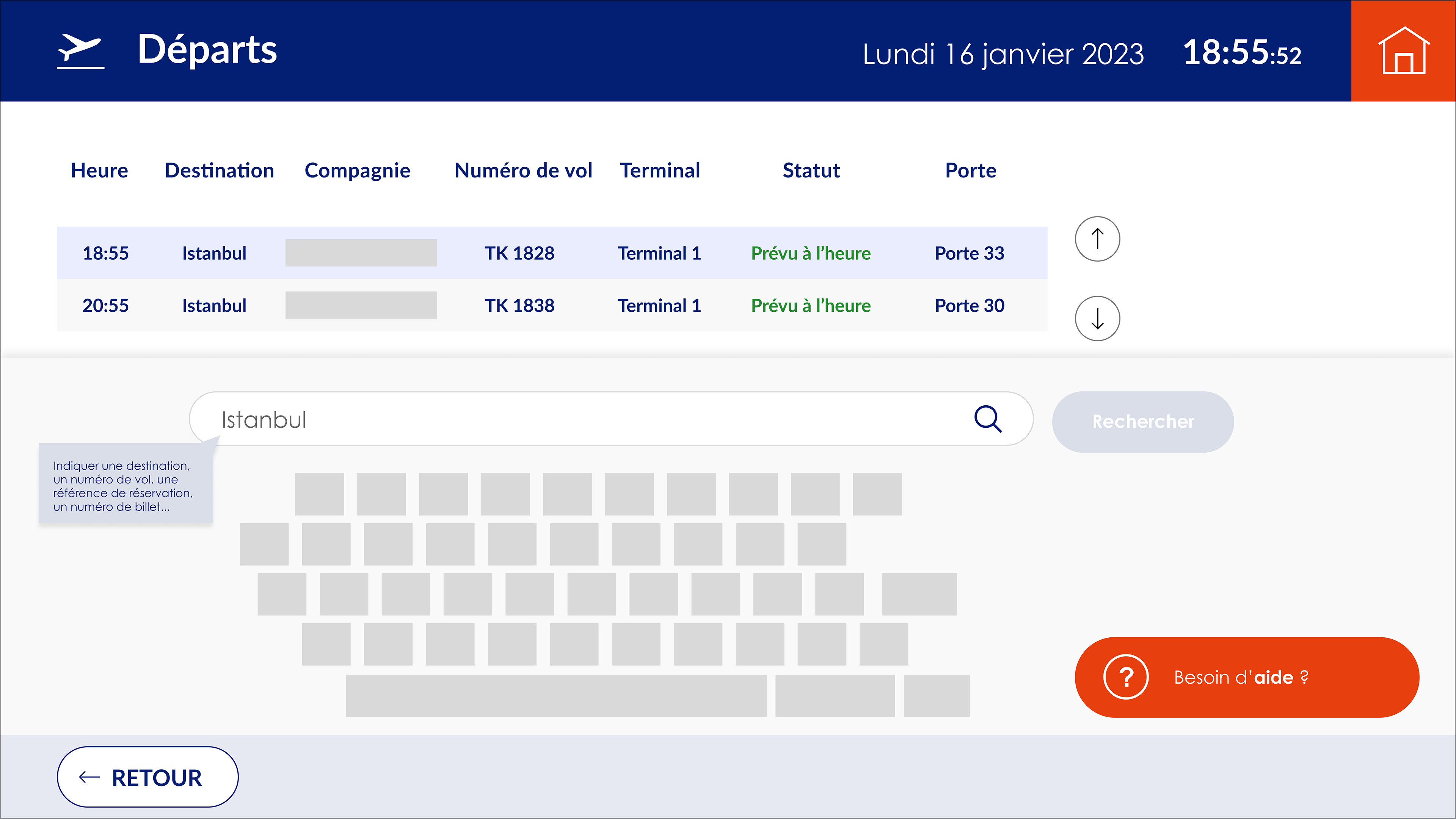
Help button: A help button has been added to guide the user, in particular by explaining how to retrieve information, such as a flight.
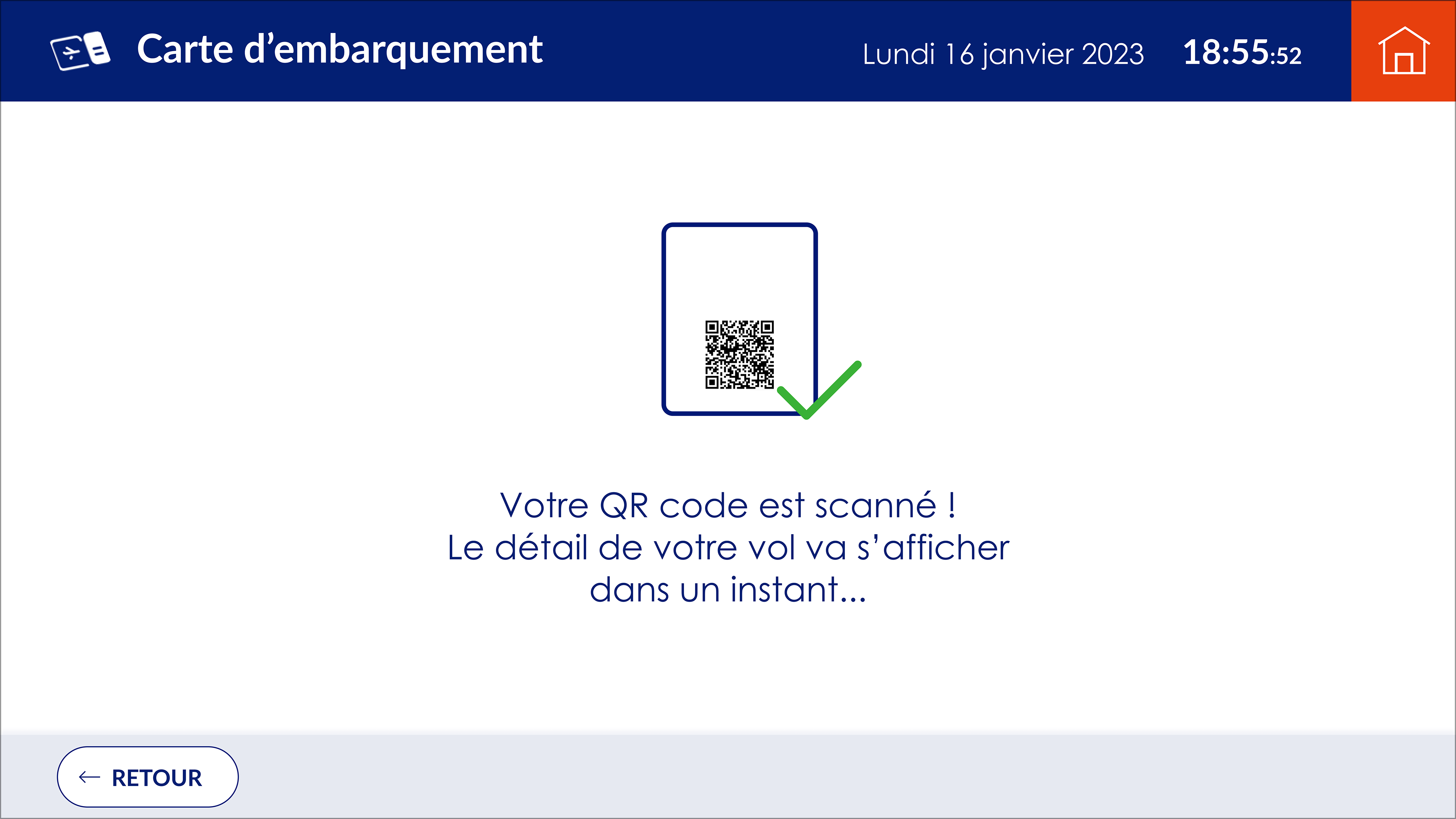
Scanning the boarding pass
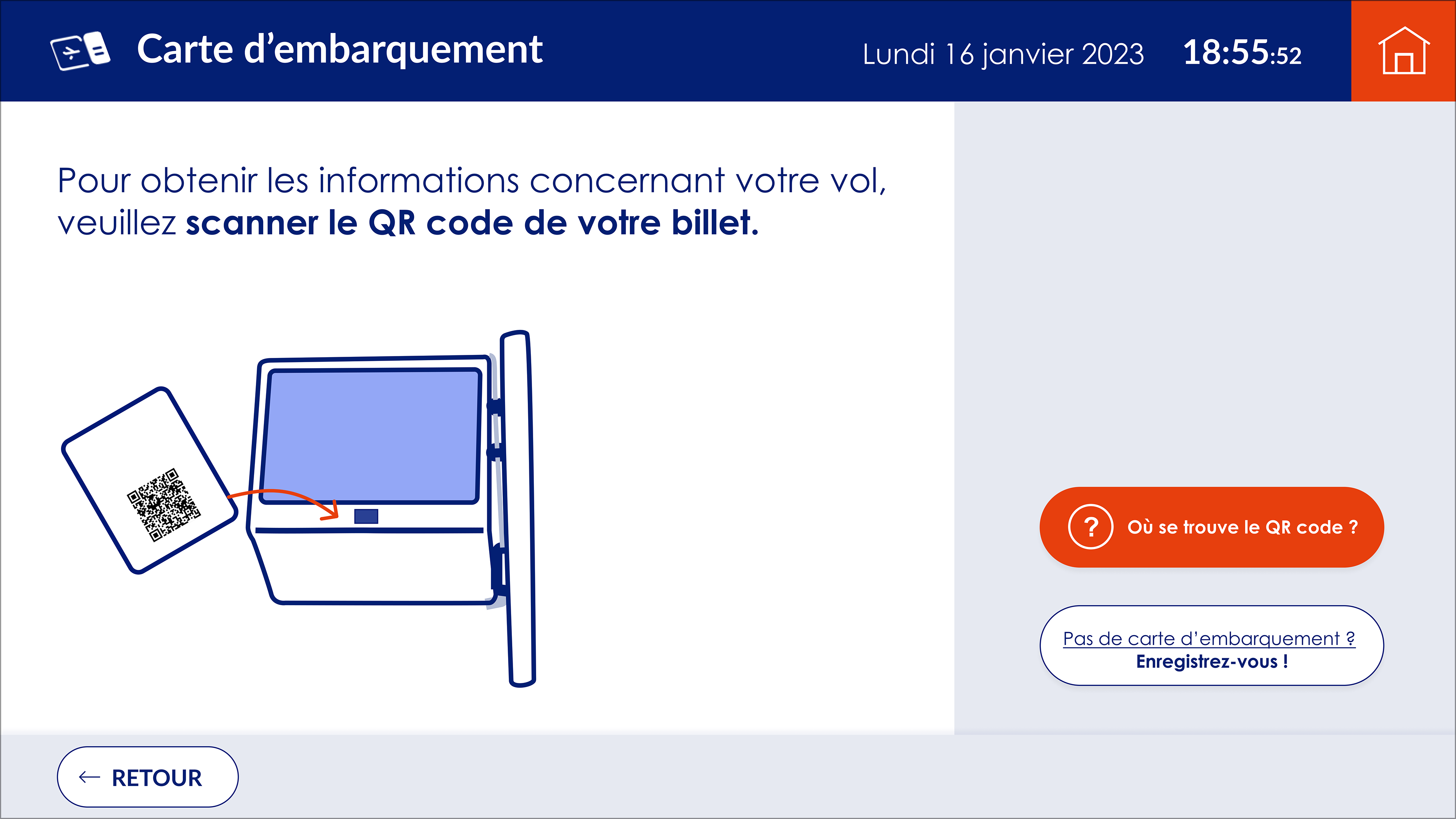
The hierarchy of information on this page complicates reading and comprehension, making it difficult to distinguish between text elements and action buttons.
Our solution: We redesigned the structure of the page, clarifying the hierarchy of information. From now on, instructions for the user are placed on the left-hand side of the screen, while action buttons, for obtaining help or performing an alternative search, are located on the right-hand side. This reorganization improves legibility and facilitates navigation.
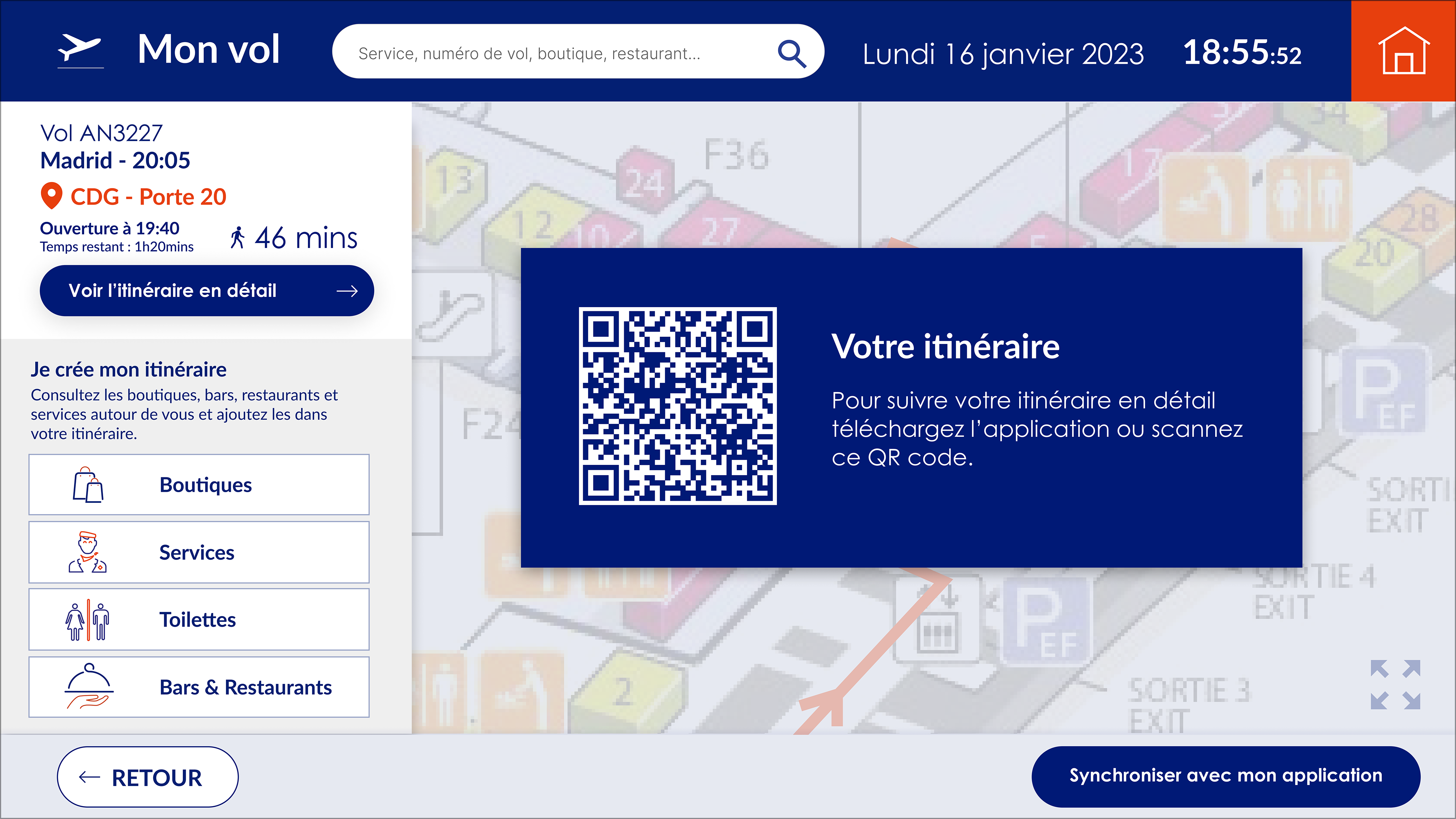
Checking my flight
The hierarchy of information on this kiosk screen does not emphasize what is essential for the user. In addition, the journey to check-in or boarding was not conducive to exploring the airport's stores, restaurants and other services.
Our solution: We reorganized the screen to better highlight key flight-related information, while visually distinguishing the different types of journey. A new section now allows users to add stops to their itinerary, such as stores or services. This transforms the previously linear journey into a more flexible one, integrating the services offered at the airport.
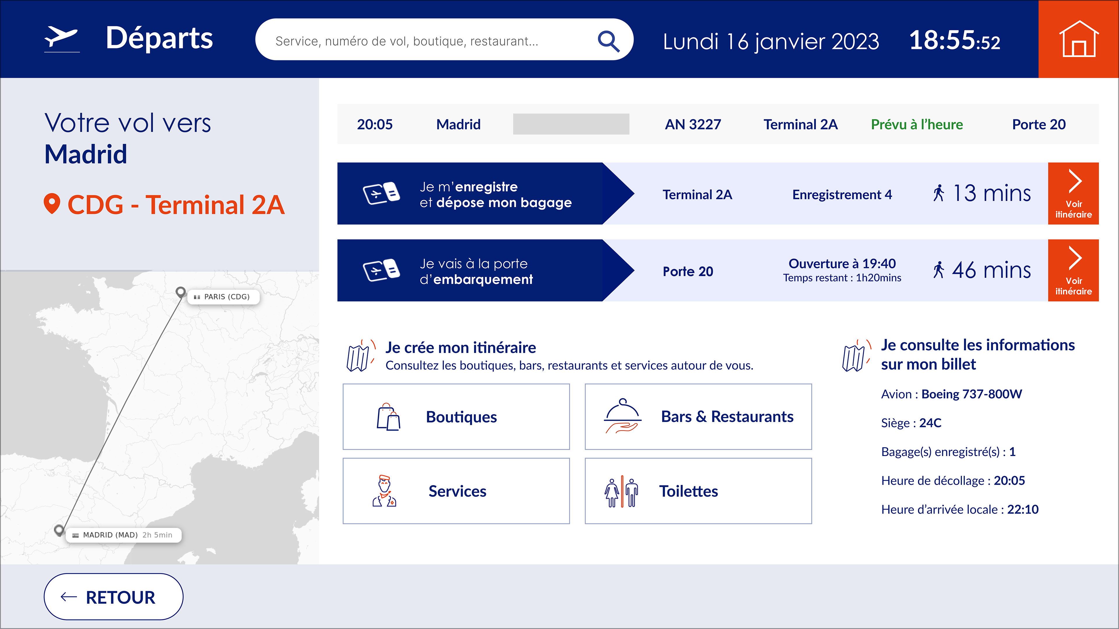
Creating an itinerary

Switching to the mobile application for live location
The functionality of linking the kiosk to the application is currently under-exploited. Yet it's a key option that deserves to be placed at the heart of user journeys.
Our solution: We have integrated this functionality in a more visible way across different itineraries, offering the possibility of transferring the itinerary consulted on the kiosk directly to the mobile application. When a user clicks on the dedicated button, an explanatory message appears on the screen to guide them through this seamless transition between the kiosk and the app.