Optimize the performance of Brico Privé's mobile application.
Analyze user friction to increase customer satisfaction and sales, and suggest improvements.
Analyze user friction to increase customer satisfaction and sales, and suggest improvements.
Context
Brico Privé asked me to conduct a UX audit to analyze the friction encountered by users of its mobile application. The aim is to improve the app's performance, as an optimized UX leads to greater customer satisfaction and, consequently, increased sales. Even minor adjustments can bring significant value by fine-tuning the user experience.

Key roles
• Analyze friction points throughout the application.
• Analyze positive practices already implemented.
• Make recommendations with points for improvement.
• Conduct a workshop to prioritize recommendations.
Method
To conduct a UX audit, I followed eight key heuristic principles defined by Bastien & Scapin to enhance interface usability:
- Guidance: Ensuring users are well-directed through intuitive design.
- Workload: Reducing cognitive effort required to use the interface.
- Explicit Control: Providing clear control to users over their actions.
- Adaptability: Allowing flexibility for different user needs.
- Error Management: Preventing and addressing user errors.
- Consistency: Maintaining design uniformity.
- Significance of Codes: Using understandable symbols and terms.
- Compatibility: Aligning with user expectations and environment.
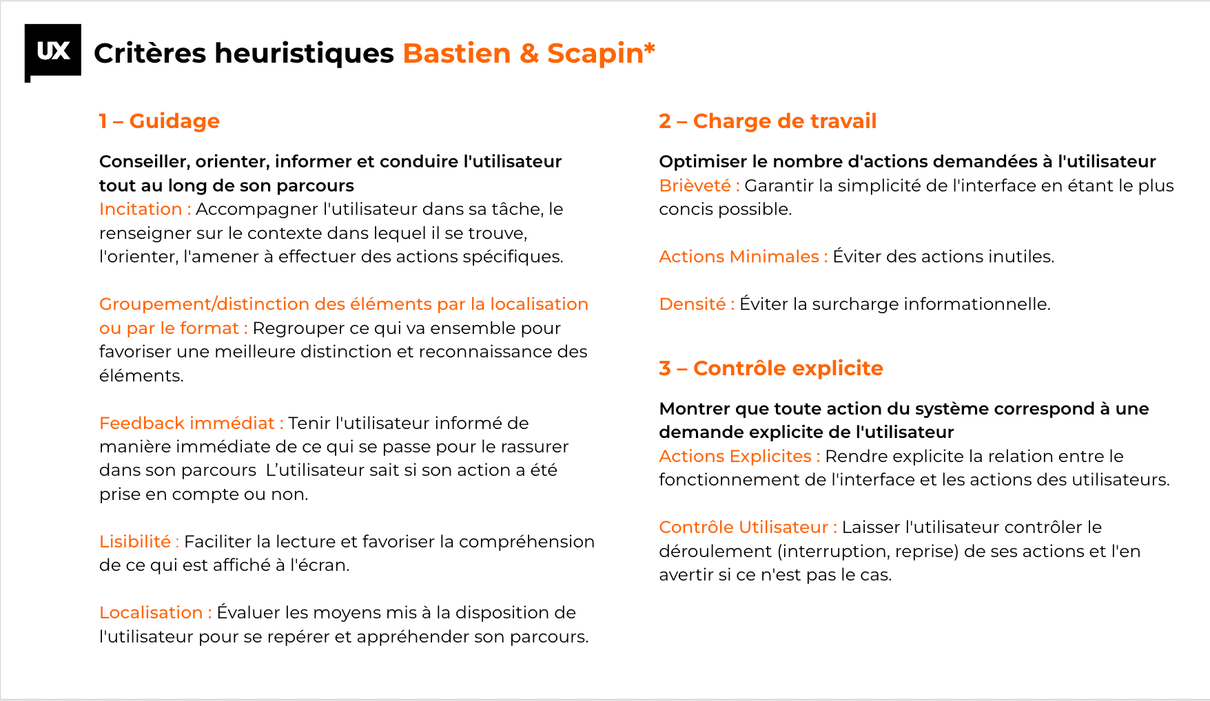

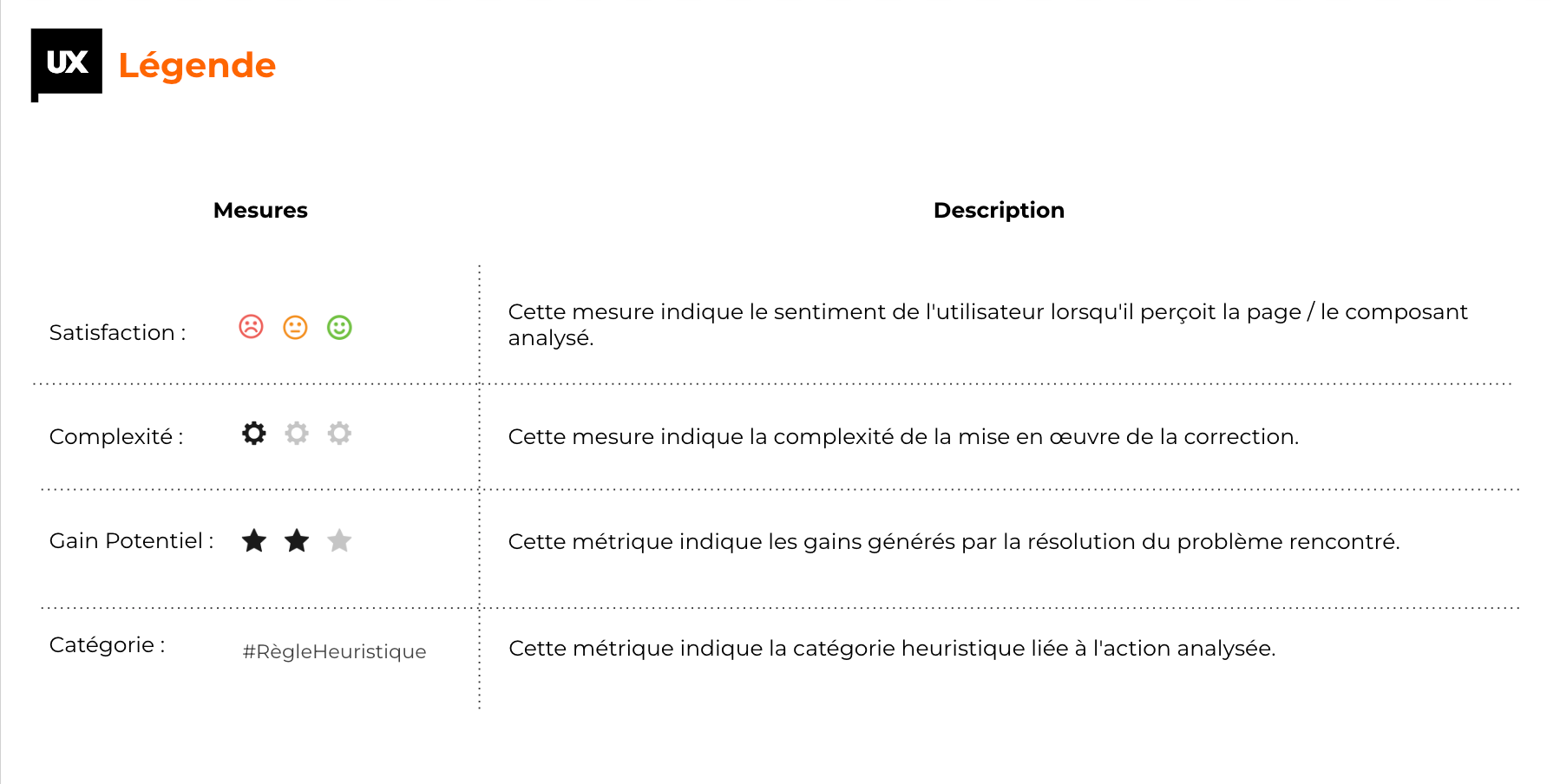
I established a legend with measures to classify my recommendations and analysis.
1. Satisfaction of user when they interact and see the screen or component.
2. Complexity of implementing the recommendation regarding the technique.
3. Potential gain rom solving the problem.
4. Category of heuristic rule related to analyzed element.
1. Satisfaction of user when they interact and see the screen or component.
2. Complexity of implementing the recommendation regarding the technique.
3. Potential gain rom solving the problem.
4. Category of heuristic rule related to analyzed element.
Convictions
Some interesting data:
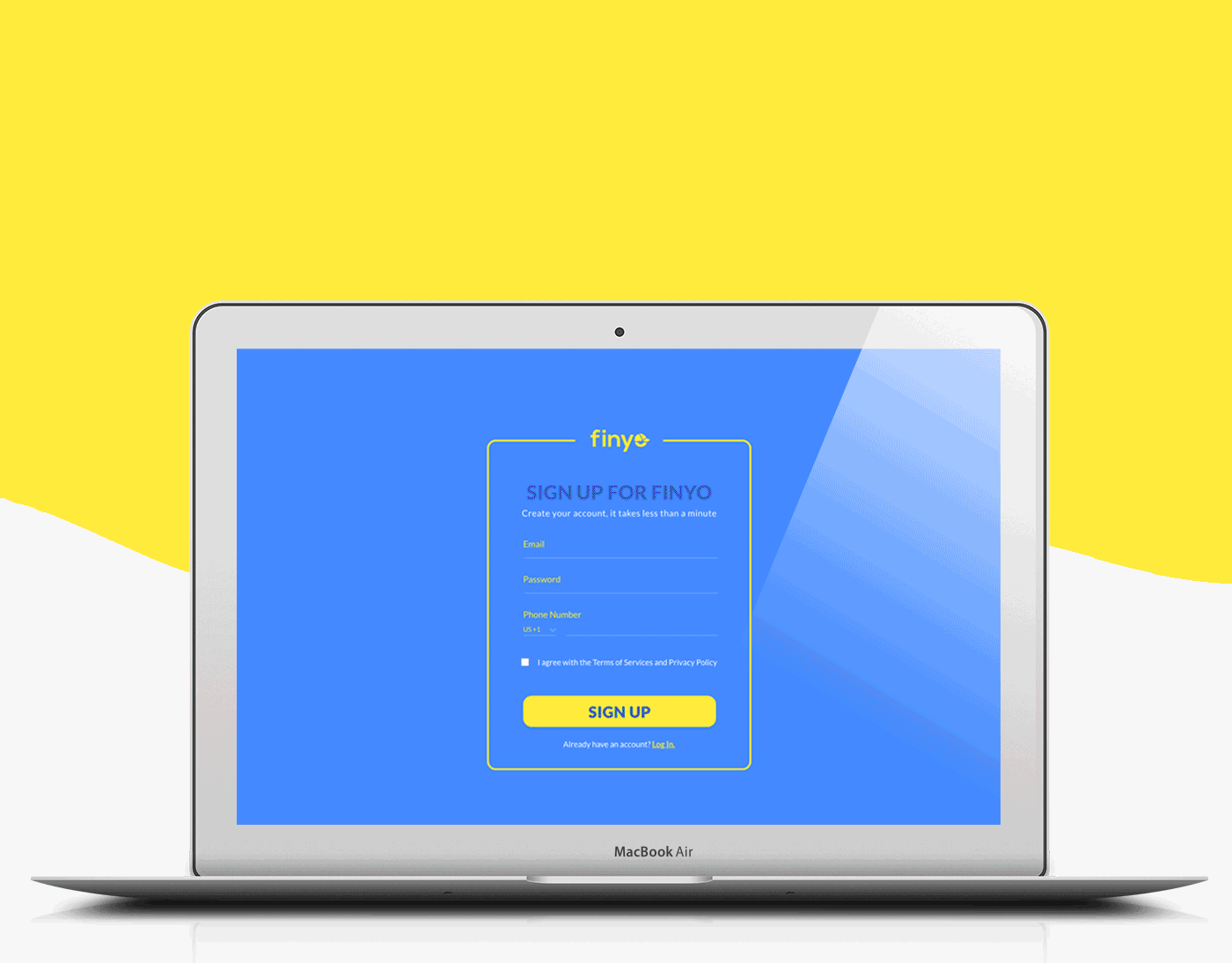
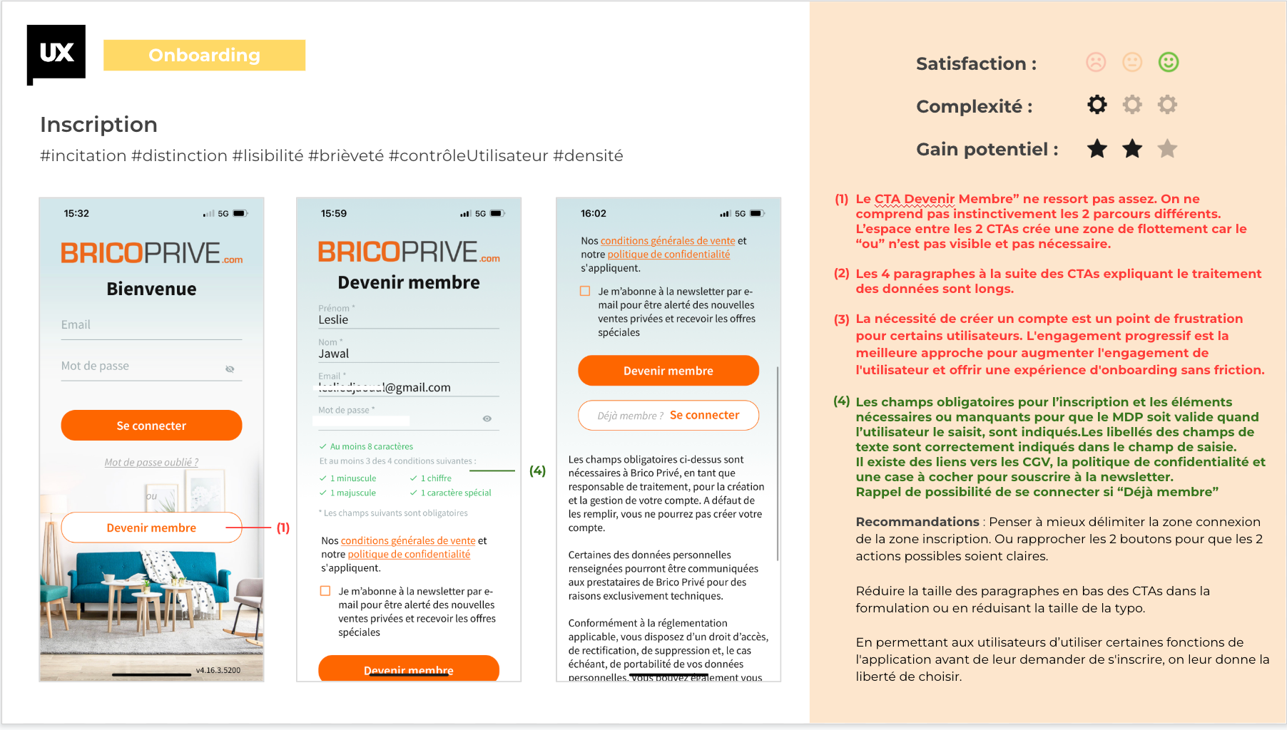
Onboarding
Over the last 30 days, the dropout rate for the login or registration stage is 84.13%. This figure is quite high and is a sign that users have not been seduced by the benefits of the application. One of the objectives of this UX audit will be to improve the Onboarding (the first arrival on your site or application) of new users.
Over the last 30 days, the dropout rate for the login or registration stage is 84.13%. This figure is quite high and is a sign that users have not been seduced by the benefits of the application. One of the objectives of this UX audit will be to improve the Onboarding (the first arrival on your site or application) of new users.
Shopping tunnel
Over the last 90 days, out of 57517 users, there are only 730 conversions at step 2 of the shopping cart (delivery step) which is a rate of 1.27% and over the last 30 days, the abandonment rate at this step is 42.54%. This indicates that difficulties are encountered at this stage.
Over the last 90 days, out of 57517 users, there are only 730 conversions at step 2 of the shopping cart (delivery step) which is a rate of 1.27% and over the last 30 days, the abandonment rate at this step is 42.54%. This indicates that difficulties are encountered at this stage.
Here are some of the goals we have set for ourselves:
Ergonomic objectives :
Understand why there is a high abandonment rate at the login and registration stage.
Understand the friction related to the purchase tunnel.
Ergonomic objectives :
Understand why there is a high abandonment rate at the login and registration stage.
Understand the friction related to the purchase tunnel.
Relational objectives :
Check what kind of information/features would retain new users.
Check what kind of information/features would retain new users.
Cross-functional objectives:
Make navigation easier, create missing connections to content that might interest them.
Make navigation easier, create missing connections to content that might interest them.
The UX Audit
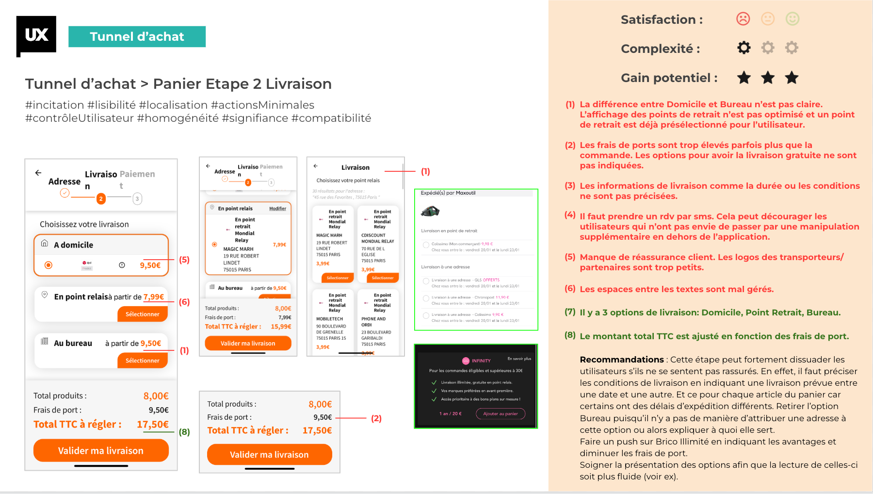
My top recommendations focus on two key areas. First, reworking the onboarding process to improve user discovery and guide them smoothly to their first purchase. Second, clarifying and simplifying step 2 of the checkout process, particularly the delivery selection, by specifying delivery times, costs, and reassuring users. Additionally, adding a "My Favorites" tab would allow users to save preferred sales, offering a more personalized experience in future interactions.

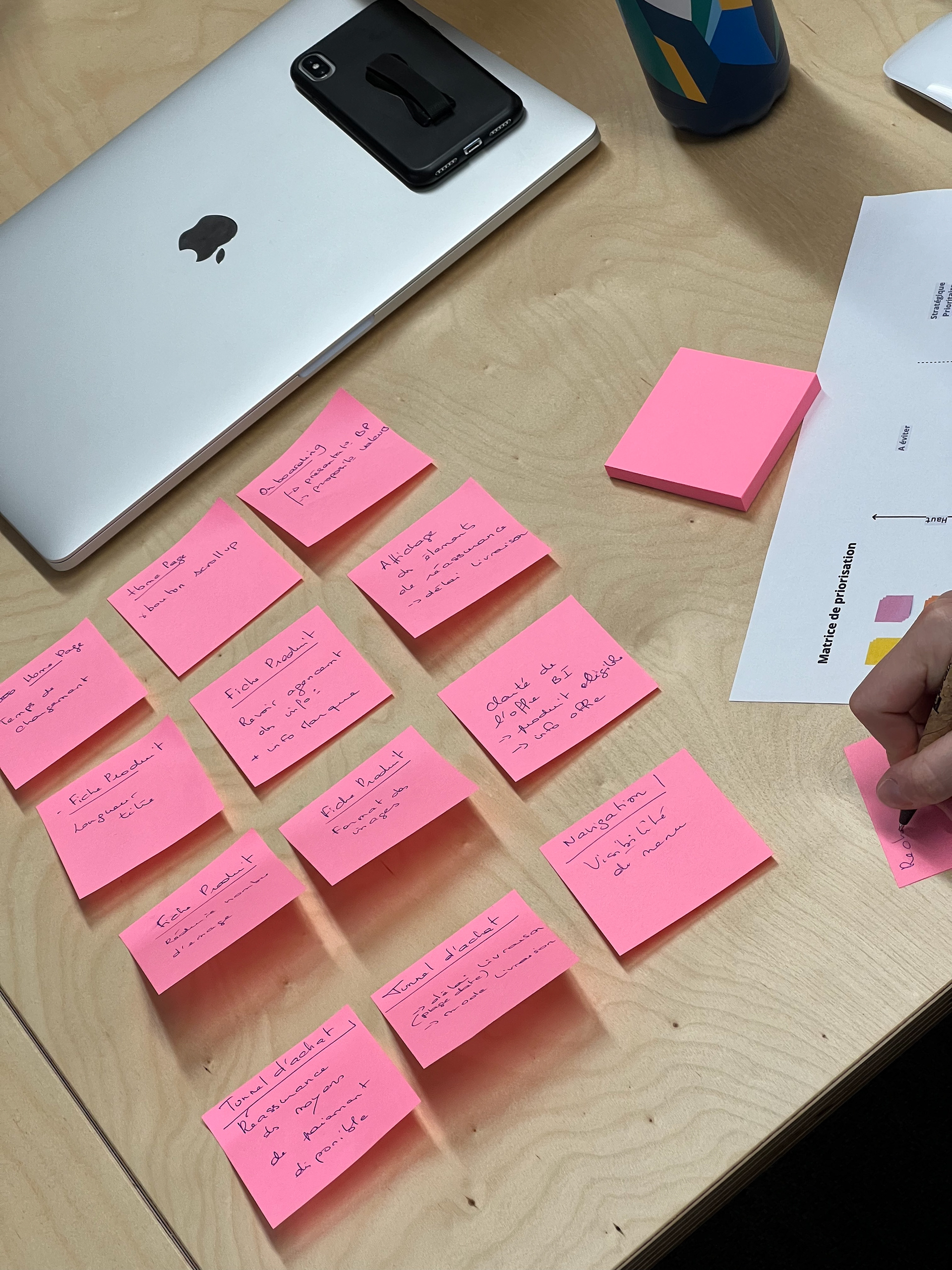
Prioritization Workshop
Create a prioritization workshop with the team.
1. Card sorting
Each participant lists the 8 features that they would like to apply or improve and that they feel are important for the application. Associate these features with the topic studied among the 8 topics covered in this audit.
30 mins (posts-it)
Each participant lists the 8 features that they would like to apply or improve and that they feel are important for the application. Associate these features with the topic studied among the 8 topics covered in this audit.
30 mins (posts-it)
2. Rank the cards on the Potential Gain vs. Complexity matrix
Each participant positions these features according to their value (high or low) and complexity (high or low).
30 mins (posts-it + A4 sheet)
Each participant positions these features according to their value (high or low) and complexity (high or low).
30 mins (posts-it + A4 sheet)
3. Pooling of answers and summary
All the information is gathered to create a single document.
30 mins (Miro)
All the information is gathered to create a single document.
30 mins (Miro)