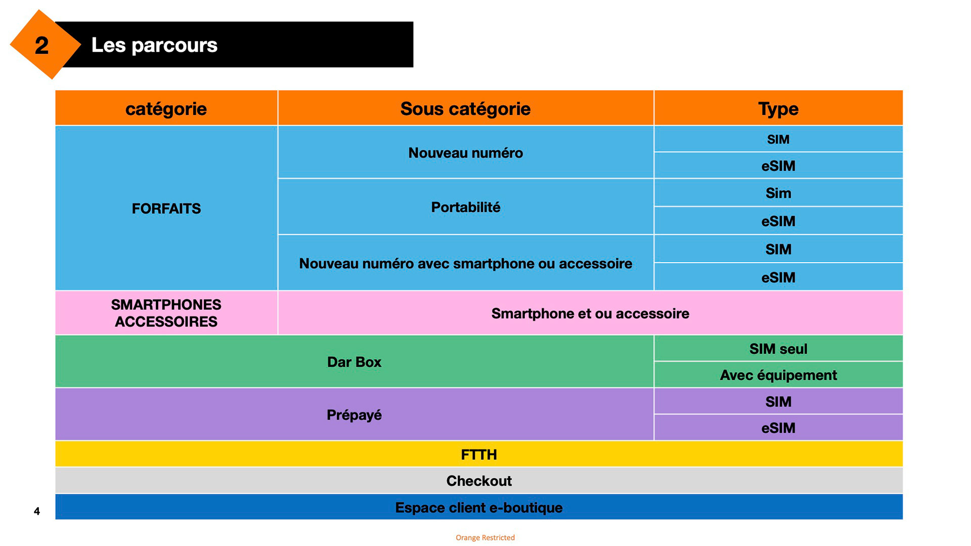
Redesign the e-boutique's customer journeys, adopting a mobile-first approach.
Design intuitive shopping flow that is adapted to the complexity of Orange offers, with the aim of increasing conversion rates and sales.
Design intuitive shopping flow that is adapted to the complexity of Orange offers, with the aim of increasing conversion rates and sales.

Context
Orange Maroc's e-boutique is facing technical limitations that are preventing the development of more modern, intuitive and high-performance interfaces. The planned technical makeover will separate the front-end from the back-end, offering greater flexibility to create optimized user journeys. Within this framework, the brand wishes to completely rethink the e-boutique's user journeys so that they are :
- Mobile First” (90% of traffic comes from cell phones)
- Better adapted to the complexity of the offers
- More intuitive
- Designed to increase conversion rates and, consequently, sales.
- Mobile First” (90% of traffic comes from cell phones)
- Better adapted to the complexity of the offers
- More intuitive
- Designed to increase conversion rates and, consequently, sales.
Key roles
•Identify user journeys to be reworked.
•Suggest solutions for friction points identified during the customer study.
•Create clear, fluid designs.
•Create graphic mock-ups for different screens, and develop mobile, web and app applications within a month.

User Study
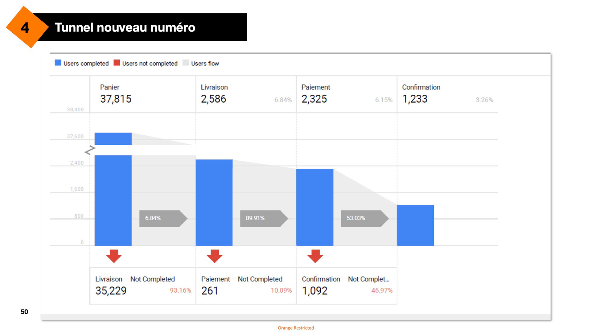
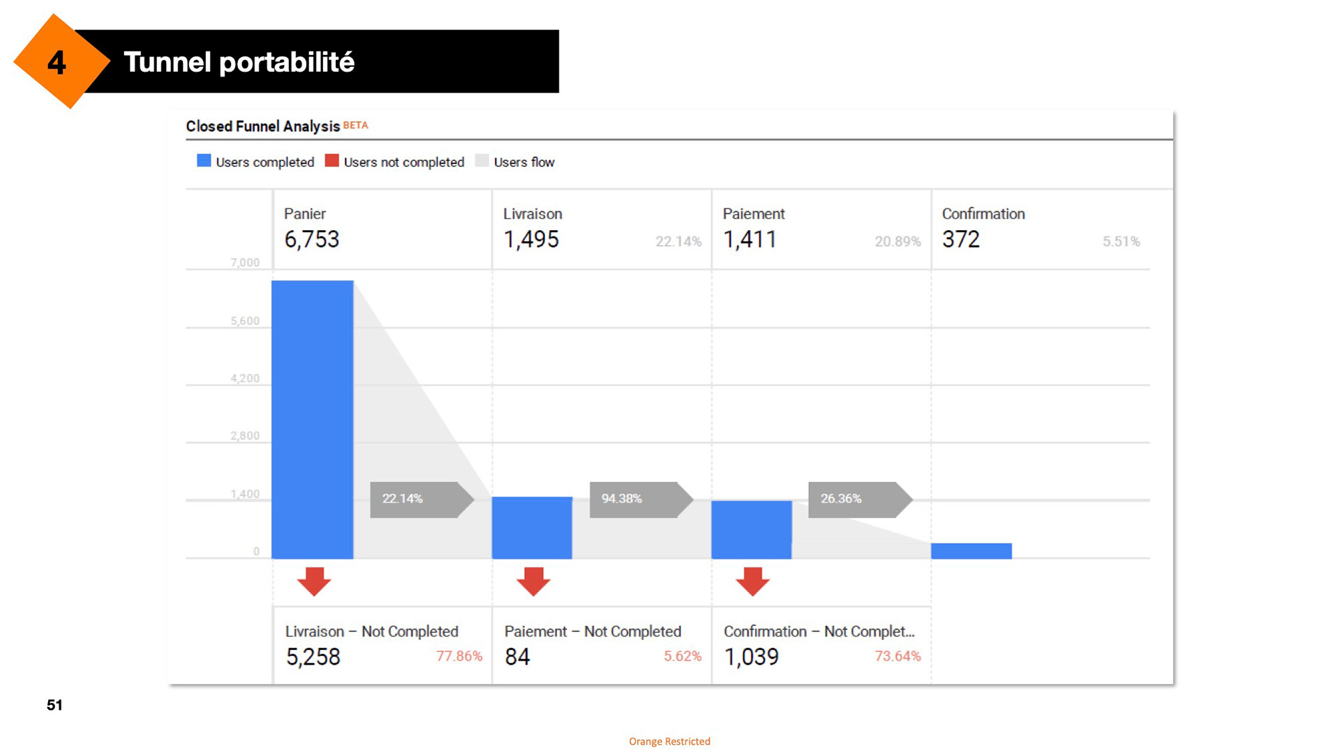
Following a customer survey, friction points and areas for improvement were identified. There is a fairly high abandonment rate in the purchasing tunnels on various journeys.
The abandonment rates in both mobile plan purchase funnels are notably high, especially in the first stages. Comparing the funnel for a new number with the one for number retention and portability, we see that in the new number funnel, only 6.84% of users proceed past the delivery stage, while 22.14% continue in the portability funnel. The new number funnel shows a more significant drop-off after the first stage (93.16% don’t complete the delivery), whereas the portability funnel retains more users but still experiences considerable drop-offs at each stage.
Areas for improvement
Explanations: Reinforce understanding of the Orange's offers, products and services.
Explanations: Reinforce understanding of the Orange's offers, products and services.
Error messages: Display clear error messages to the user when necessary, offering alternative solutions or suggestions to ensure a smooth shopping experience.
Purchase tunnel: Explain and facilitate the steps in the purchase tunnel to improve the delivery process, strengthening customer confidence by guaranteeing increased security.
Customer account: Clearly explain the purpose of creating an Orange e-boutique account after the shopping cart has been confirmed.
Transparency: Display, as soon as possible, any additional charges to be paid by the user, such as delivery charges.

This is the actual version of the eshop : Listing of Smartphones
Smartphone & Devices Flow
Improvements:
- Developed product cards highlighting key features for easier comparison.
- Developed product cards highlighting key features for easier comparison.
- Introduced special promo and new product cards, with optional countdown timers for time-sensitive offers.
- Added an "Out of Stock" button for better inventory visibility.
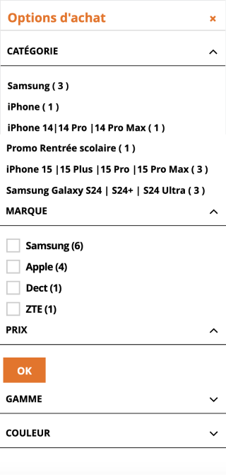
- Redesigned search filters, featuring a sticky bar layout at the top of the product list for quick access.
- Incorporated a "Back to Top" button alongside infinite scroll functionality for smoother navigation.
- Incorporated a "Back to Top" button alongside infinite scroll functionality for smoother navigation.
Redesigned Desktop version

Redesigned

Devices listing before
Filters before
- Optimized mobile layout to display up to two products above the fold.
- Added suggested filters and sticky sorting options at the bottom of the page for easier navigation.
- Enhanced clarity and organization of search filters for better usability.
- Introduced suggested filters based on price range to help users refine their searches efficiently.
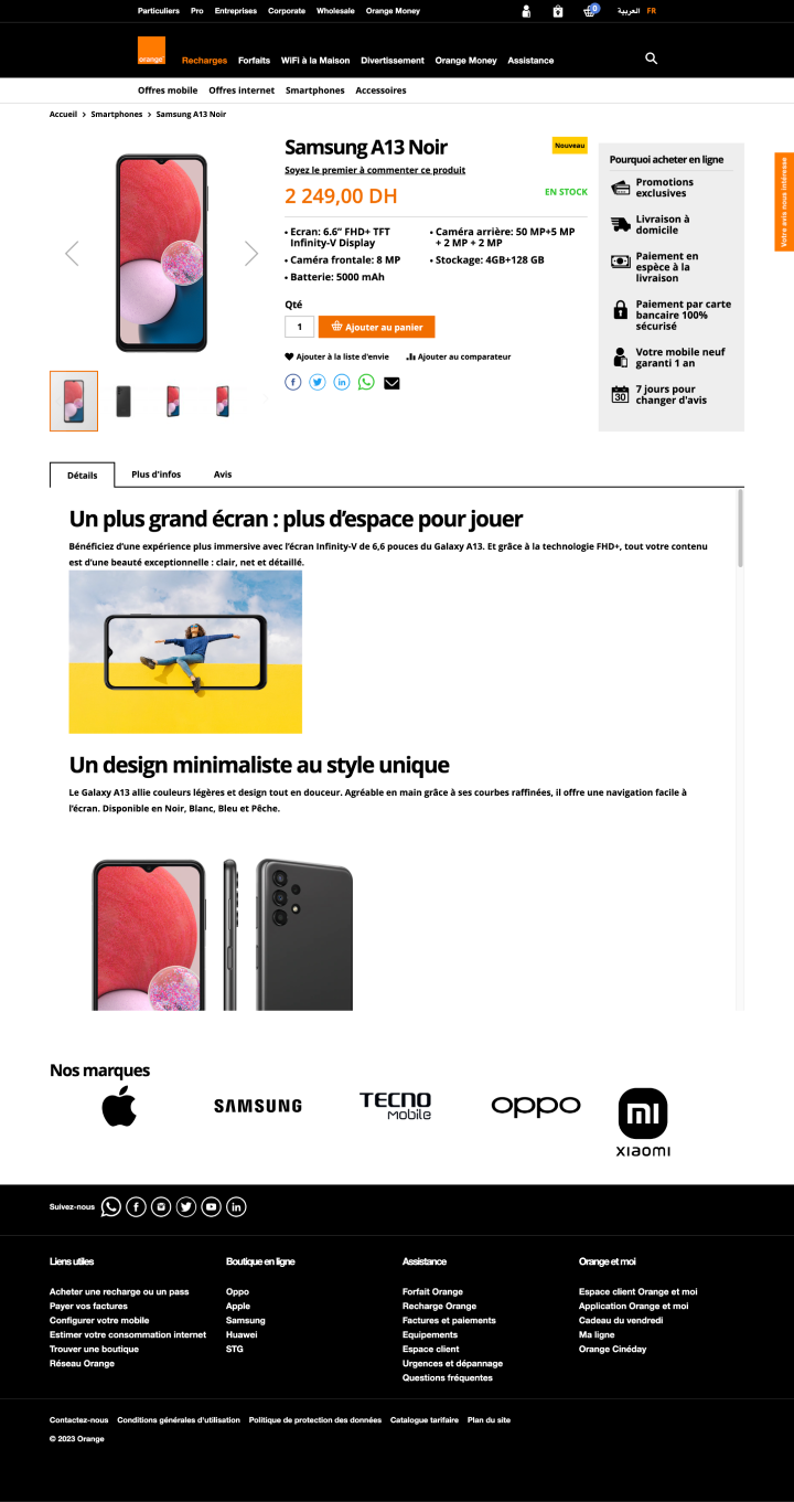
Product page before
Product Page
Improvements:
- Restructured the product page with a fixed left column for product images and a scrolling right column for product features, ensuring a clearer layout.
- Restructured the product page with a fixed left column for product images and a scrolling right column for product features, ensuring a clearer layout.
- Added estimated delivery time and payment method details to minimize frustration during the checkout process.
- Integrated cross-selling opportunities and promoted additional Orange services to enhance user engagement.
- Implemented reassurance elements for online purchases, boosting user confidence in the buying process.
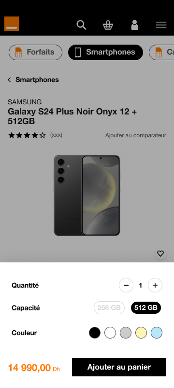
For the mobile version, I implemented a sticky "Add to Cart" CTA at the bottom of the page, constantly displaying the product price for user convenience. If additional settings are needed before adding the product to the cart, users are prompted to make the required selections upon clicking the "Add to Cart" button.

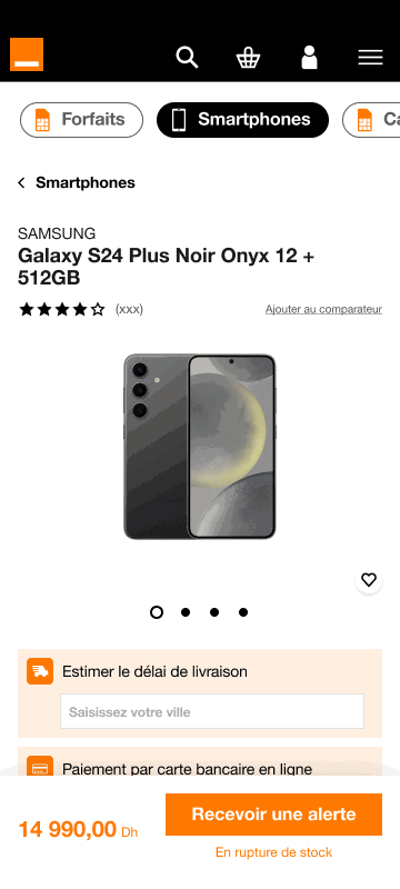
The out-of-stock process was streamlined for a smoother user experience. Now, with just a few clicks and the entry of an email address, users can sign up for availability alerts directly, bypassing the need to log in or create an account. This reduces friction, making it faster and more convenient for users to stay informed about product restocks.
Improvements:
- The "Add to Cart" process is now more seamless, allowing users to continue shopping without disruption. A banner at the top confirms the item added to the cart, while two sticky CTAs at the bottom offer the option to either keep shopping or view the cart immediately.
- The "Add to Cart" process is now more seamless, allowing users to continue shopping without disruption. A banner at the top confirms the item added to the cart, while two sticky CTAs at the bottom offer the option to either keep shopping or view the cart immediately.
- Users can simply tap anywhere on the screen to dismiss the notifications and continue browsing, enhancing flow and reducing unnecessary steps.

Added-to-Cart Page Before

Added-to-cart page redesigned
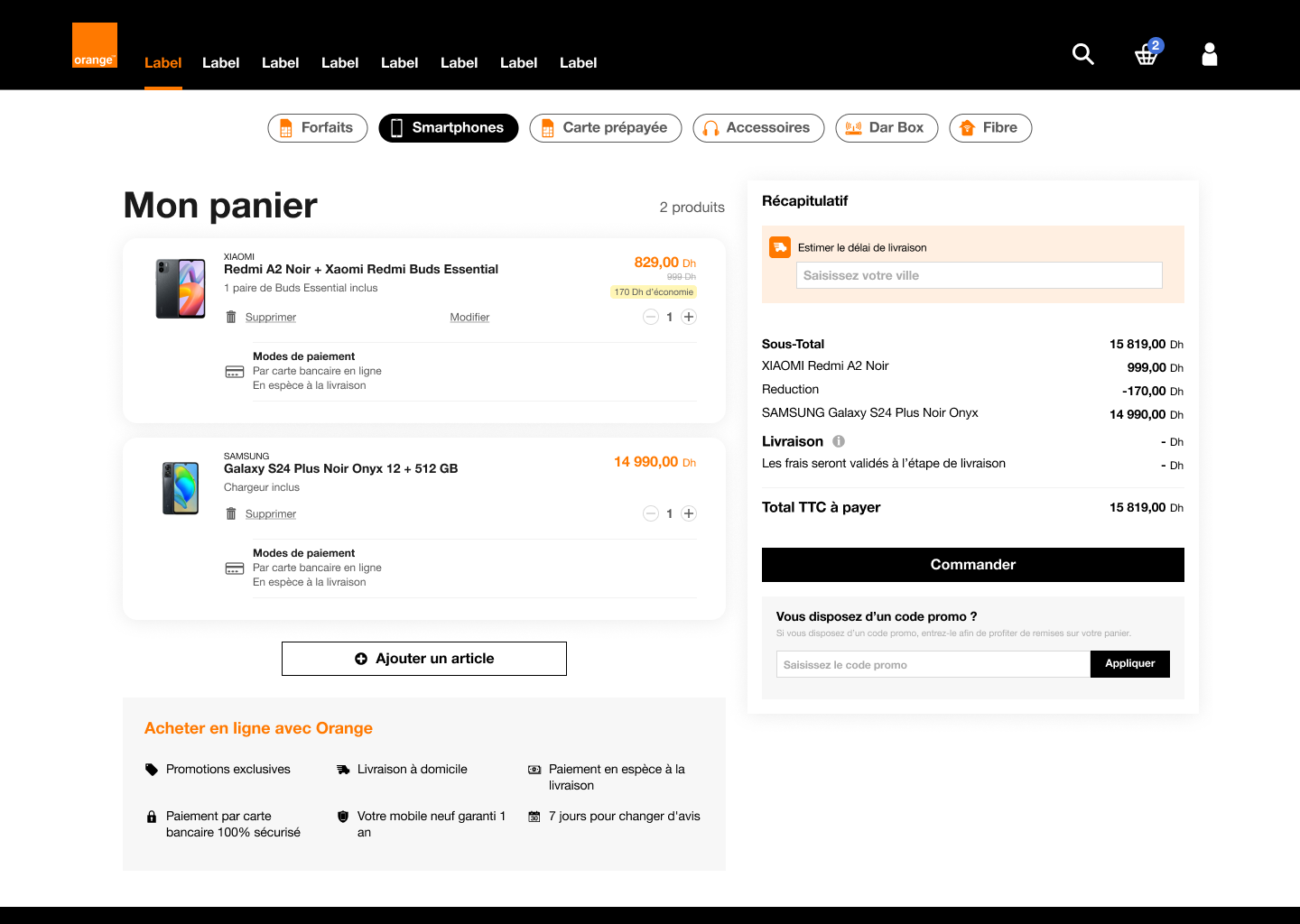
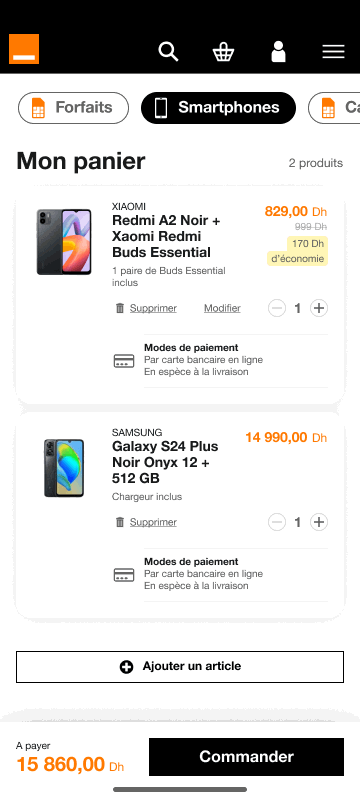
Cart
Improvements:
- Better optimization of space with an order summary placed in a dedicated column on the right, allowing the user to quickly view details and the total.
- Better optimization of space with an order summary placed in a dedicated column on the right, allowing the user to quickly view details and the total.
- Added benefits sections, making the page more informative and reassuring, increasing user confidence.
- The order summary is highlighted with distinct colors, making it easier to read key information (subtotal, VAT, total incl. VAT), reinforcing transparency at checkout.
- The integration of the promo code field is more fluid, and the “Checkout” button is better highlighted with a brighter color contrast, simplifying cart validation.
- These visual and structural improvements encourage users to finalize their purchase and reduce the risk of cart abandonment.

Cart before
Cart Page Desktop Redesigned
Cart Page Mobile Redesigned
Mobile Plans

Mobile plans listing before
Improvements:
- Visual simplification with offers organized by price range, each package better identifiable thanks to spacious boxes and a varied color palette, improving legibility and facilitating decision-making.
- Clearer differentiation between packages according to usage (internet, calls, social networks), making the page more intuitive.
- Personalized user experience, making it easy to choose a package according to main usage, reinforcing the adaptability of offers to customers' specific needs.
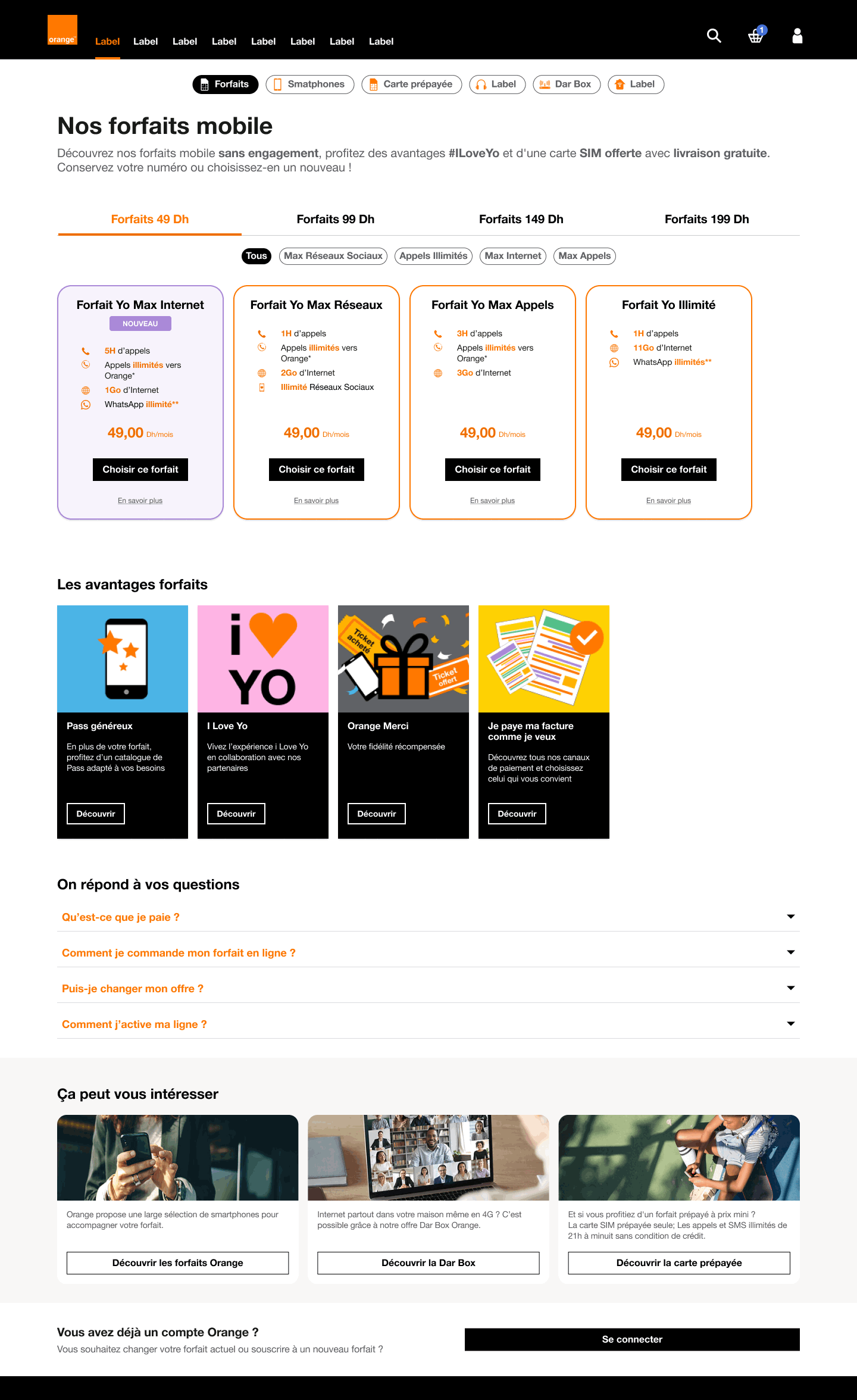
Mobile plans listing redesigned
- Design optimized for mobile browsing, with more airy sections and more visible and accessible call-to-action (“Choose”) buttons, taking into account the predominance of mobile traffic.
- Attractive visuals to highlight benefits and additional options, and clear links to frequently asked questions, making useful information more accessible to the user.
- Attractive visuals to highlight benefits and additional options, and clear links to frequently asked questions, making useful information more accessible to the user.

Mobile Plan - Portability
Improvements :
- Structured portability process: The process has been broken down into three clear stages: identification of the number and operator, choice of SIM and verification of the number, reducing errors and facilitating progress.
- Added explanations: Instructions are now provided for each step, preventing the user from getting lost in the process.
- Validated input fields: Each field is validated in real time when correctly filled in, giving the user a sense of security and smooth navigation.

Before

Redesigned"
Mobile Plans - New number
Improvements :
- Clarified subscription route: the process has been redesigned to start with a choice between applying for a new number or keeping one's current number, making the rest of the route smoother and more comprehensible.
- Improved selection and explanations: after this first step, the user can choose from a selection of numbers and select the type of SIM card required. Additional explanations have been added at this stage to avoid any confusion.
- Improved CTAs: CTAs are now “sticky”, remaining visible throughout the journey. They activate or deactivate according to the user's actions, facilitating fluid and intuitive navigation.

New number flow redesigned
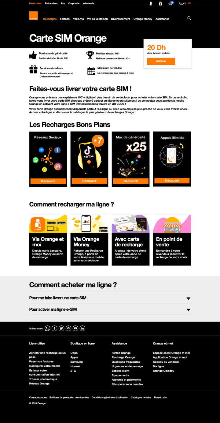
Prepaid SIM Card
Prepaid card listing before
Improvements :
- Attractive, intuitive design: Color harmonization and visual architecture have been improved to make content more attractive and encourage user engagement. The layout has been redesigned to offer an optimized reading experience, with distinct sections for fluid, intuitive navigation.
- Attractive, intuitive design: Color harmonization and visual architecture have been improved to make content more attractive and encourage user engagement. The layout has been redesigned to offer an optimized reading experience, with distinct sections for fluid, intuitive navigation.
- Presentation of benefits: All the benefits and details associated with the prepaid offer are now explicitly presented, ensuring a better understanding of the options available.
- Redesigned question block: This module has been transformed into a guided, step-by-step process, making it easier for users to obtain their SIM card.


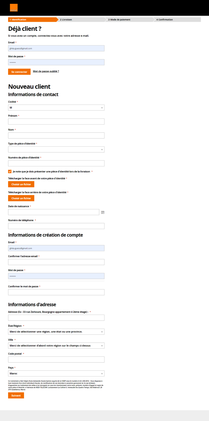
Checkout - Authentification
Checkout first step before
Improvements :
- The checkout process has been optimized to offer a smoother experience, reducing the abandonment rate.
- The checkout process has been optimized to offer a smoother experience, reducing the abandonment rate.
- The user can choose to continue as a guest, avoiding the need to create an account. Only essential information is requested, minimizing friction while guaranteeing security.
- To better guide the user, the identification stage has been divided into two distinct parts: entry of contact information and validation of proof of identity. Clear visual indicators make it easy for users to track their progress.
- Unlike the previous version, the basket summary remains visible throughout this stage. This ensures that the user keeps the details of his purchase in mind without interruption, reinforcing the transparency and fluidity of the shopping experience.
- All input fields now include a label, a placeholder text and an indication of whether they are mandatory or not.

Checkout - Identity Justification
Améliorations :
- Suppression d'un point de friction majeur : Cette étape, autrefois source de confusion pour les utilisateurs en raison de l'absence de guidage, a été entièrement repensée pour améliorer l’expérience.
- Suppression d'un point de friction majeur : Cette étape, autrefois source de confusion pour les utilisateurs en raison de l'absence de guidage, a été entièrement repensée pour améliorer l’expérience.
- Explications claires et détaillées : Afin de résoudre ce problème, des explications complètes et faciles à comprendre ont été ajoutées pour accompagner les utilisateurs tout au long du processus.
- Amélioration des blocs de téléchargement : Les zones de téléchargement pour la pièce d'identité ont été retravaillées pour une utilisation plus intuitive. Il est désormais possible de glisser-déposer directement les fichiers dans les blocs dédiés. Les sections pour la face avant et arrière sont clairement distinctes, et des informations sur les formats et tailles de fichiers acceptés sont bien visibles.
- Chaque champ correctement complété est désormais signalé par une icône de validation (check), réduisant ainsi les risques d'erreurs et garantissant une expérience fluide.

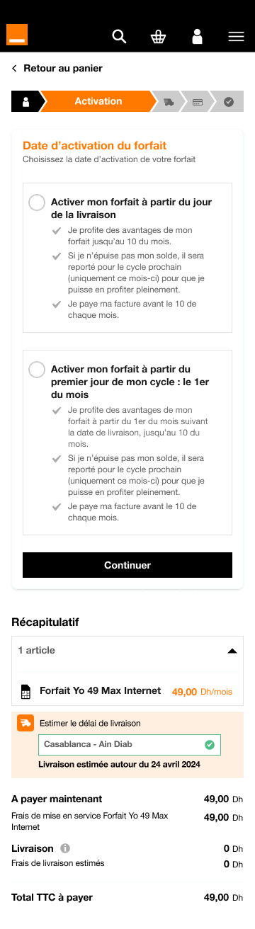
Checkout - Activation
Improvements :
- Logical separation of steps: In the previous version, delivery and package activation were grouped together on the same page, although the two actions were not necessarily linked. Now, users can make their choices independently, with package activation becoming a separate step, placed immediately after identification in the checkout path.
- Logical separation of steps: In the previous version, delivery and package activation were grouped together on the same page, although the two actions were not necessarily linked. Now, users can make their choices independently, with package activation becoming a separate step, placed immediately after identification in the checkout path.
- Clear presentation of options: The two activation options are now presented more explicitly, with detailed explanations for each choice, to guide the user and enable him to make an informed decision.
Checkout - Delivery
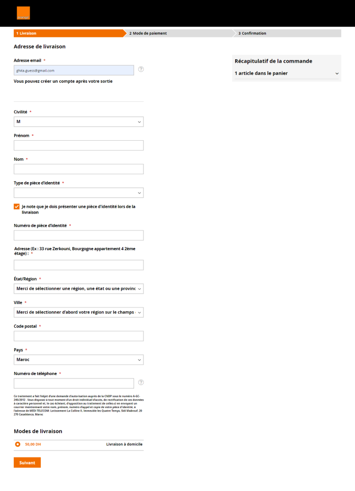
Delivery step before
Improvements :
The delivery stage, which used to be long and unexplained, has been optimized for a smoother, more intuitive experience.
The delivery stage, which used to be long and unexplained, has been optimized for a smoother, more intuitive experience.
- Reduction of unnecessary fields: Non-mandatory fields have been removed, simplifying the form and reducing process time.
- Form optimization: The form has been completely redesigned with the integration of features such as auto-completion, keyboard input in a drop-down list, clear placeholders, and validation of mandatory fields, guaranteeing a faster, more ergonomic experience.
- Transparency on charges and delivery times: once the address has been added, a banner displays updated charges and delivery times directly in the basket summary, ensuring continuous transparency throughout the shopping experience.

Delivery step redesigned
Checkout - Confirmation

Confirmation before
Improvements :
- Complete redesign for greater clarity: Confirmation pages have been redesigned to provide users with all the essential information related to their purchase: detailed purchase summary, selected payment method, delivery information and activation dates, as well as guidance on next steps.
- Complete redesign for greater clarity: Confirmation pages have been redesigned to provide users with all the essential information related to their purchase: detailed purchase summary, selected payment method, delivery information and activation dates, as well as guidance on next steps.
- Engaging wording: The tone has been adjusted with more positive and encouraging language, reinforcing user satisfaction and fostering loyalty.
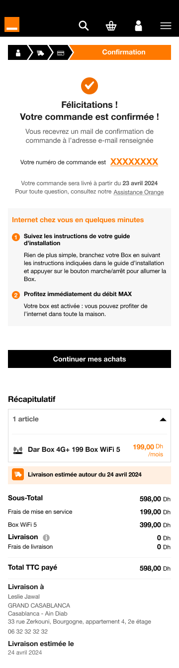
Confirmation redesigned
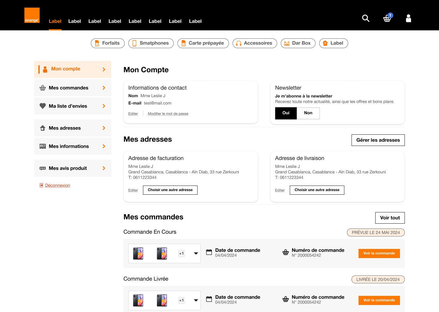
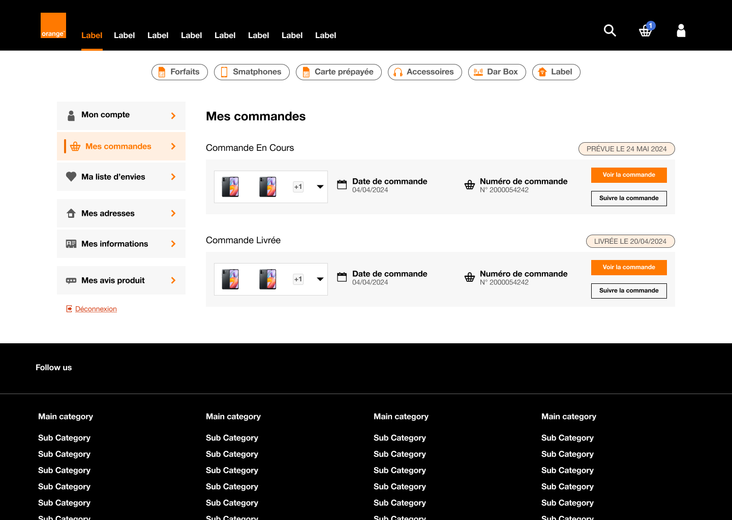
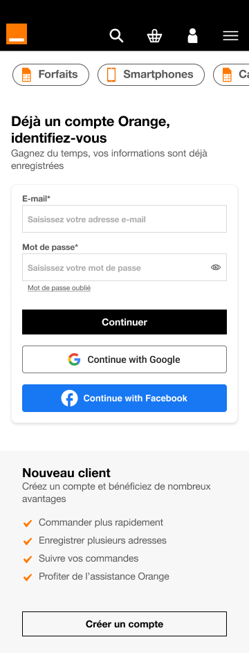
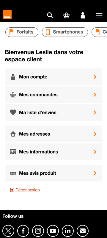
Customer account

Improvements :
- The Customer Area login page has been redesigned to offer greater flexibility, now allowing users to log in via Google or Facebook. The benefits of creating an account are also highlighted more prominently, encouraging registration.
- The Customer Area login page has been redesigned to offer greater flexibility, now allowing users to log in via Google or Facebook. The benefits of creating an account are also highlighted more prominently, encouraging registration.
- The home page has been customized, with an easy-to-navigate list menu. Headings have been grouped together for clearer organization, and icons have been added for easier understanding.
- The logout link is now clearly distinguished from the other tabs, ensuring fluid, intuitive navigation.